

The Daily Roxette discussions forum has been closed. The forum is only available as a read-only archive.
New design?
36 replies
Zelda said on November 22, 2005 15:34:
Hello
don´t you think it´s time for a brand new design?
Some Robbie Williams pages looks so great and modern.
ally77 said on November 28, 2005 20:23:
They have been working really hard behind the blinds... and I think it will be worth the wait!
harriej said on November 29, 2005 18:25:
For me this website is ok just as it is right now, but I don’t know what kind of new things Roxeteer will introduce.
If it are nice improvements, I am looking forward to them ;)
rox-kuryliw said on December 5, 2005 12:00:
I think the yellow is abit umm garish, needs to be more sleek and stylish like roxette :-D I also think they should be an option to add a pic of ones self to out name (profile) page if you know what i mean.
tevensso (moderator) said on December 17, 2005 10:20:
Talked to Visa yesterday and he’s swamped with stuff, so I doubt the new version will be out in December. :(
harriej said on December 31, 2005 14:04:
It is personal of course, but i like it the way it is.
I have seen a lot of other forums, which are a lot more “flashy”, but that doesn’t mean it is a better forum.
Maybe the lack of all those “flashy” things, like emoticons, avatars etc. makes this such a clear, good forum.
We’ll see what the new things will be, and then I am willing to give my judgement whether it is an improvement or not.
The website of my sportclub (http://www.dkc-delft.nl) was changed lately as well: I liked it the way it was before the change, but now it is even better then before, so I am not AGAINST a renewing of the site, as long as it is indeed an improvement!
brentnewtown said on January 11, 2006 09:52:
and considering that not everyone has high speed internet, a too flashy site would disadvantage those people.
ally77 said on January 12, 2006 08:38:
That’s true, and that is also something that annoys me on another forum I use they limted siggys to 150x150 pixels for those on dial up! grrrrrrrrrrr
marcusvandeursen said on January 16, 2006 15:57:
personally I think TDR has the most clean and best-to-navigate forum at the moment. R2R and SOAP.com look just so messy with all these smilies banners and so on...
Chaghi said on January 17, 2006 00:41:
I’m also a big fan of the clean design of TDR’s Smalltalk. When you let people mess around with colors and fonts and smileys and banners, you end with a bloated, big, slow-to-load colorfull collage... not a fourm.
harriej said on January 24, 2006 22:03:
couldn’t agree more with marcusvandeursen!
All those smileys etc. are not needed
filfish said on March 8, 2006 21:23:
I agree that the colour scheme could do with a bit of a makeover, but as for the general design and layout of smalltalk, I like it.
Maybe an option to allow you to select your own colour scheme from a set of pre-designed ones would be nice.
Roxeteer - I do a little with PHP (though I don’t pretend to be anywhere near as good as you) but if your in need of an extra pair of hands feel free to let me know, if I can help at all, I’d be pleased to.
KixGuy said on August 4, 2006 21:05:
I think that a neutral design is very nice. I remember acessing www.roxservice.com and it was the best Roxette-related site I ever seen (in terms of design too!)!
whateveriam said on August 5, 2006 16:28:
Neutral good. Can see this going a nice shade of magnolia...
japeke said on August 29, 2006 23:17:
I hope they won’t change the design to something what matches with the designs we already saw....
RJ1976 said on September 3, 2006 13:29:
I love this site... !!! Could be black and white... I dont care :)
Allllll rreeeeesppppeeect to the people fron TDR
The no. 1 site on the planet ....
But funny... I also thought about that... A new design is always funny... And if it dont work... Change it back :)
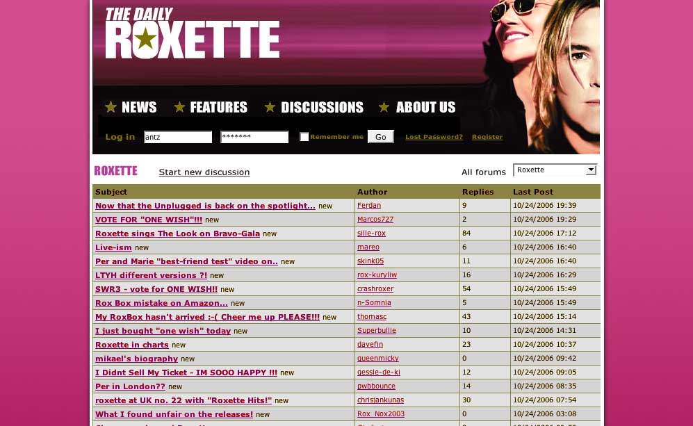
antz said on October 29, 2006 03:45:
Well this is my idea for new design. I know it copies the Roxette Hits site but I think pink will be a nice change from all the orange!!!!!!!
http://photos1.blogger.com/blogger/5978/1358/1600/dailyroxette1.jpg
http://photos1.blogger.com/blogger/5978/1358/1600/dailyroxette2.jpg
pwbbounce (moderator) said on October 30, 2006 12:54:
I so hope it’s not gonna be pink!!! I don’t mind the orange colours really. And it’s so simple to view the site too. A lot more so than many newer forums
antz said on November 20, 2006 21:29:
Thanks. After second thoughts I think the pink might be a bit much! I had hoped that TDR’s new design would have had some references to the Hits cd. Oh well what can you do?
Rox-Van said on November 20, 2006 23:15:
It’s Ok, simply and directly, I have no objections, but I miss the old design... ;-)
* One Wish, If you had one wish, what would it be?- Roxattaq Argentina http://usuarios.lycos.es/roxamerica/ - se viene mi cumple ;-)*
Kathrin said on April 11, 2007 17:19:
I have an Idea for a new TDR design, look at this TH Website,I like that Design:http://thfanclub.com/forum/index.php
————————————————————————————————————————————————
Life is like a Box of Chocolates, you never know what you gonna get!
Galadriel said on April 11, 2007 23:44:
@Kathrin: You are kidding, aren’t you!?
All this black with the white font hurts my eyes badly!
Kathrin said on April 20, 2007 21:52:
——–
No, But at least there you can put Pictures in your Post!
———————————————————————————————————————————————————
Life is like a Box of Chocolates, you never know what you gonna get!
Galadriel said on April 21, 2007 12:21:
You can insert pictures in a lot of forums, for example here www.sonofaplumber.com/forum ;-)
It doesn’t have to have such an eye hurting look like the one you mentioned.
Kathrin said on April 23, 2007 20:04:
Oh, I have a Better idea: why not make something with Hearts and Roses as a Background!
—————————————————————————————————————————————–
Life is like a Box of Chocolates, you never know what you gonna get!
Galadriel said on May 4, 2007 21:23:
I don’t believe there will be any eye catching background here in the near future. And btw.what’s the connection of Roxette with “Hearts and Roses”??
Kathrin said on May 8, 2007 20:07:
I just thought that it might look good!
—————————————————————————————————————————————————————
Life is like a Box of Chocolates, you never know what you gonna get!
roxeteer (moderator) said on November 22, 2005 19:09:
I don’t know about RW sites, but I agree. I’m working on it. I was hoping to get new stuff live this year, but we’ll see.